

You have about three seconds before a visitor decides whether your store gets their money or their back button. That is not an exaggeration, it is how fast trust forms online, before a single product description gets read.
Here is the part that stings: most of what tips that decision has nothing to do with your product. It is page speed, a search bar that actually finds things, a checkout that does not interrogate people before they have even added a card number. Get those wrong and you are not losing bad-fit visitors, you are losing shoppers who were ready to buy and left for a competitor’s tab they already had open.
The good news is that the gap between a store that converts and one that just collects traffic is not a mystery, and it is not a full redesign either. It comes down to specific, fixable features, each backed by real conversion data rather than a hunch.
Here is exactly what they are, and why each one earns its place on this list.
1. A Search Bar That Actually Works
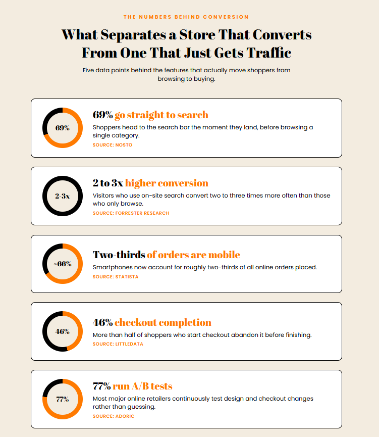
Search is not a secondary feature. Around 69% of shoppers head straight to the search bar when they land on an ecommerce site, and visitors who use search convert two to three times more often than those who browse categories alone, according to Forrester Research. A search bar that’s easy to find is only half the job. It also needs autocomplete, since roughly one in ten search queries contains a typo, and results that surface the most relevant products first instead of a wall of loosely matched items.
2. Navigation That Takes Three Clicks or Fewer
If a shopper needs five clicks to find a product category, most won’t make it that far. Clear, well-labeled navigation, organized by how customers actually think about products rather than how a warehouse organizes inventory, keeps people moving toward a purchase instead of back to search. For stores with large catalogs, this means a logical hierarchy of categories and subcategories. For smaller stores, it often means resisting the urge to add extra menu layers that don’t need to exist yet.
3. Mobile-First Design, Not Mobile-Adapted Design
Smartphones account for roughly two-thirds of online orders, and a majority of shoppers now consider mobile shopping a baseline expectation rather than a nice-to-have. A site built for desktop and then shrunk down to fit a phone screen almost always shows it: buttons too small to tap accurately, text that requires zooming, images that take too long to load on a mobile connection. Designing for the smallest screen first, then adding detail for larger ones, produces a faster and more consistent experience across devices.
4. Fast Page Load Times
Every extra second a page takes to load increases the odds a visitor leaves before seeing anything. Compressed images, minimal unnecessary scripts, and browser caching are unglamorous, but they do more for conversion than most redesigns. This matters most on product listing and category pages, where a shopper is comparing several items and won’t wait for each one to render.
5. Product Pages With Real Information
A product page needs to answer the questions a shopper would ask in a physical store: what does this look like from multiple angles, what does it feel like or come with, and has anyone else bought it and been happy. High-resolution images from more than one angle, specific (not vague) descriptions, and visible customer reviews all do measurable work here. Star ratings and review counts in particular give shoppers a fast way to judge quality without reading every word on the page.
6. A Checkout That Doesn't Ask for Too Much
The average ecommerce checkout completion rate hovers around 46%, meaning more than half of shoppers who start checking out don’t finish. A large share of that drop-off comes from checkouts that demand account creation, ask for information that isn’t needed to complete the order, or bury the total cost until the final step. A single-page checkout that collects only what’s required for shipping and payment, with account creation offered afterward rather than required upfront, keeps far more people through to the confirmation page.
7. Multiple Payment Options
Not every shopper wants to enter a credit card number. Offering PayPal, Apple Pay, or similar accelerated checkout options removes friction for the portion of visitors who’d rather not, or can’t easily, type in full card details on a phone. This is a small addition with an outsized effect on completed orders, since it’s often the difference between a shopper finishing the purchase in one tap and abandoning the cart to “do it later.”
9. Accessible Design
Keyboard-navigable menus, sufficient color contrast, and screen-reader-friendly product information aren’t optional extras. They determine whether a meaningful share of visitors can use the site at all. Accessible design also tends to overlap with generally better usability: larger touch targets and clearer text benefit every visitor, not just those using assistive technology.
10. Ongoing Testing, Not a One-Time Launch
The stores that keep improving conversion rates over time are the ones that treat design as a continuous process. Roughly 77% of major online retailers run some form of A/B testing on their sites, comparing button colors, page layouts, or checkout flows against real visitor behavior rather than guessing what will work. A feature that seems obviously better in a design meeting doesn’t always perform better with actual shoppers, which is the entire reason to test rather than assume.
The Common Thread
Every feature on this list solves the same underlying problem: reducing the effort and doubt between a shopper arriving on a site and completing a purchase. Search and navigation reduce the effort of finding a product. Trust signals and reviews reduce the doubt about whether to buy it. A fast, simple checkout reduces the effort of finishing. A user-friendly online shopping website isn’t one flashy feature, it’s the accumulation of a dozen small ones that each remove a reason to leave.